BPO Soluciones
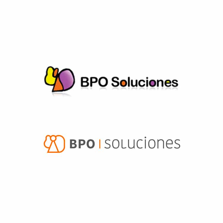
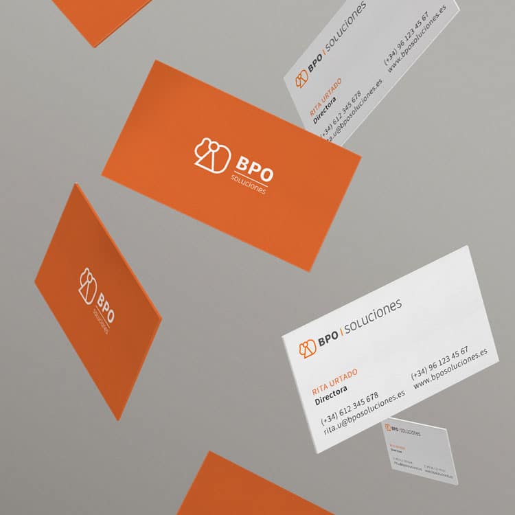
BPO Soluciones, a company outsourcing labor, fiscal and financial services of large companies, wanted a restyling of its website, a change of image, but maintaining the logo to preserve its personal character. From Quality Marketing Contents we synthesized formally and chromatically the logo to convey values of professionalism and seriousness.
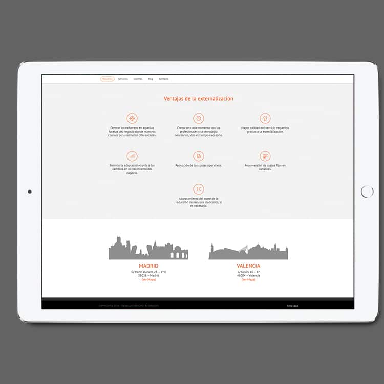
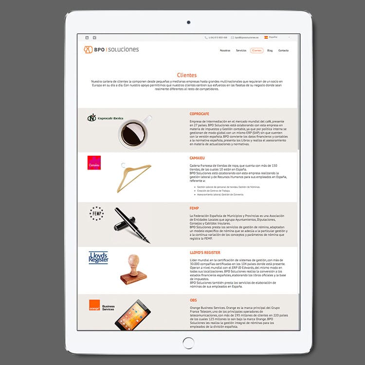
The next step was to extend that new image to the online platform. The colors were orange and black, which gave it a more serious character, while it went from pages full of text and without any image, to much more visual pages, outlined and that transmitted to the visitor a sense of order and clarity.
• Restyling of the brand.
• Chromatic simplification.
• Adaptability of the web to the corporate colors.
• Web restyling.
• Retouching and designing images.
• Making of infographics.
•Layout of contents.
• Blog management.
• Generation of contents.
• Generation of the Content Plan.
Client: BPO Soluciones
