MED ALOE
Project: Positioning strategy.
The change of naming was the beginning of the new creation of an attractive brand for Algabasa. We left the old name and we opt for Med Aloe (Aloe Mediterranean). This decision was based on a strategy of positioning against the competition.
We wanted also to promote a distinguishing feature of our client, whose plant is cultivated on the Mediterranean where the environment is excellent. We have not forgotten the international market and for this reason we looked for a word that could be understood in different parts of the world.
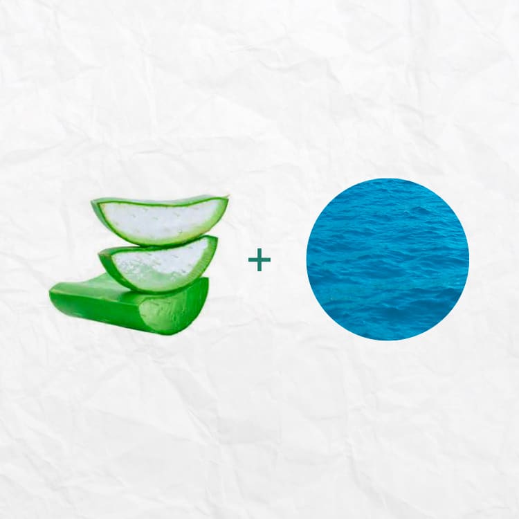
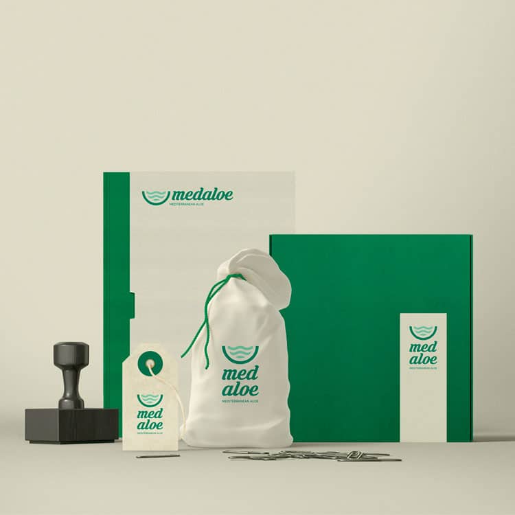
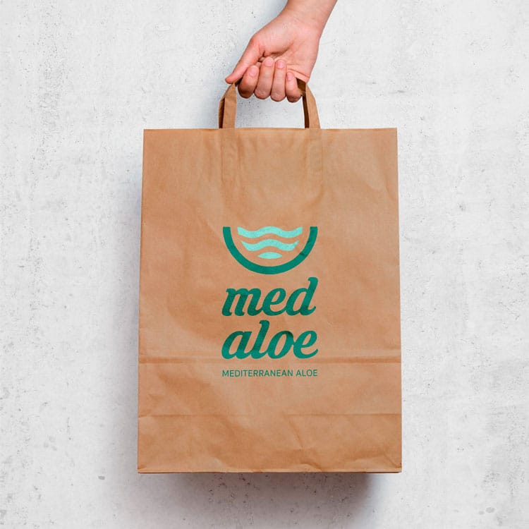
The next step was the logo. We have worked in a design that will bring quality to the product, and convey natural and sustainable processes. The forms are simple and kind, always linked with nature and providing confidence and safety. Regardless of superfluous elements the symbol is the fusion of the sea with a section of aloe vera.
Client: Algabasa


